Measure ridership, load factor, costs, emissions, and satisfaction to decide whether a shuttle pilot should become permanent.

A shuttle pilot should answer one question: keep it, change it, or stop it. We would not judge it by ridership alone. We would look at four core proof points: use, cost per boarded rider, commuting CO₂ impact under Scope 3 Category 7, and rider feedback.
If we had to sum up the article in a few lines, it would be this:
A few data points matter more than most. Peak load factor around 60-80% is often treated as a healthy range, while below 50% can point to weak use and above 90% can point to crowding. The article also flags on-time performance above 95% as a common marker for a service that shift workers can trust.
What we like here is the basic idea: a pilot is not a launch; it is a test. So the job is not to defend the pilot. The job is to measure whether a permanent programme would be worth the spend in €, useful for staff, and aligned with corporate sustainability management and commuting emissions reporting.
| What to check | Why it matters |
|---|---|
| Ridership and load factor | Shows whether people use the service and whether seats are sized right |
| Cost per boarded rider | Shows what the service costs at pilot level and what may change at scale |
| Reliability | Shows whether staff can depend on the shuttle for shift start and end times |
| Scope 3 Category 7 impact | Shows whether the shuttle cuts employee commuting emissions |
| Rider satisfaction | Shows what ridership numbers alone cannot explain |
So before moving from pilot to permanent, we would want one clear view: what the shuttle did during the test, what it is likely to do at scale, and what assumptions sit behind both.
Measure only what helps answer one question: should this shuttle pilot become a permanent service? These metrics feed into the scale model in the next section.
Track boarding and alighting counts by stop and time block across the full pilot period. Breaking the data into 15-minute intervals [2] makes it much easier to spot where demand builds up and when it drops off. That matters a lot when you’re dealing with fixed shift start and end times.
Load factor shows the share of seats filled on each trip. In most cases, a load factor of 60-80% at peak is seen as a healthy range for system efficiency [2]. If it stays below 50%, the service is likely underused. If it sits above 90% again and again, that points to overcrowding or missing capacity [2]. Both are issues, but they call for different responses.
Don’t read load factor on its own. A full shuttle doesn’t help much if people can’t count on it. For shift-based workforces, track reliability side by side with usage. That means on-time performance, missed trips, and average wait times should all be measured separately [1].
Cost per boarded rider is your total operating cost divided by total boarded riders during the pilot [1]. Include vehicle costs, driver hours, fuel, insurance, technology, and administration. It also helps to keep setup costs in a separate note, so finance can tell the difference between recurring spend and one-off pilot spend.
Split costs into fixed costs and variable costs. Fixed costs include items like the vehicle and insurance. Variable costs include fuel and extra driver hours. This matters because fixed costs are spread across more riders as service grows.
That’s why a route can look expensive per rider during a pilot, then look very different once it runs at full service levels. If you don’t know which costs change with volume and which stay flat, the scale model won’t tell you much.
Scope 3 Category 7 covers employee commuting emissions. During the pilot, estimate how many car trips are avoided each day, then apply a standard emissions factor for the vehicle type and distance involved. The goal is simple: show whether the shuttle cuts commuting emissions enough to support a permanent service. Use the same method from start to finish so reporting stays consistent.
Pair that emissions number with rider satisfaction data. Ridership tells you how many people used the service. It does not tell you what got in their way. Short pulse surveys in the middle of the pilot and again at the end can help you track convenience, travel time, reliability, and safety.
| Metric category | What to track | Why it matters for the decision |
|---|---|---|
| Usage | Boardings and alightings by stop, time block, and shift | Right-sizes fleet and shows peak demand |
| Economics | Cost per boarded rider, fixed vs. variable cost split | Supports accurate scale modelling |
| Reliability | On-time performance, missed trips, average wait times | Helps predict repeat use for shift workers |
| Emissions | Estimated car trips avoided, carbon dioxide reduction | Supports Scope 3 Category 7 reporting |
| Satisfaction | Pulse survey scores on convenience, travel time, reliability, and safety | Helps explain ridership trends that raw data cannot |
This article provides general information only. It does not constitute legal or tax advice.
Once you have pilot usage data, look at it trip by trip, not just at the full program level. The program average is often the least helpful number in your pilot data. It can make ridership look healthy overall while hiding a route with a low load factor at one time of day and a single departure that’s packed at another.
That’s why it helps to read the same data at trip level. You can spot which departures need more capacity and which ones need a schedule change. And that feeds straight into the keep, revise, or stop decision your team set before the pilot began.
The table below shows what each view tells you, and what you might miss if you stop there.
| View level | What it reveals | Risk of stopping here |
|---|---|---|
| Site/program view | Total ridership, overall cost per boarded rider, high-level emissions reduction | Hides specific trips that are failing or over capacity |
| Route view | Performance of specific geographic corridors | May hide peak-period load factor problems on individual departures |
| Trip/shift view | Exact load factor for individual departures | Overlooks the need to right-size vehicle capacity for high-demand windows |
Use the same load factor thresholds for each departure, not the program average. That split shows whether you need to change:
Do that before you model the permanent service.
Low ridership at the start often reflects habit formation, not failure. In plain terms, people need time to get used to a new service. So treat the early pilot period as a ramp-up phase, not a final verdict.
What should you watch for? A steady rise in boardings usually points to a normal ramp-up. If ridership stays flat or starts to fall after the awareness phase, low use on certain trips usually signals a schedule mismatch or a route coverage issue, not a lack of interest in the service as a whole [3].
Track no-shows on their own. If bookings stay steady but boardings drop, demand is not the main problem. The issue is missed cancellations [3]. That’s a communication and reminder problem, so fix that before changing the service.
This distinction helps you separate short-term ramp-up effects from structural underuse.
Start by rebuilding the permanent service from the ground up using the trip-level patterns from the pilot. Look at demand by route and shift, then set frequency, vehicle size, and operating hours based on what the data shows. Don’t just roll the pilot setup into the long-term model. The pilot was a test. The permanent service should be designed for what comes next.
Pilot load factor is a useful guide here. It helps you match vehicle size and frequency to actual rider patterns instead of guessing. If a route was half-empty, a smaller vehicle or fewer departures may make more sense. If demand was tight at peak times, that points to a different setup.
Operating hours should come later. First confirm where demand is steady. Then extend the service window where the numbers support it.
Pilot cost per boarded rider often looks worse than the long-term picture because the test phase carries setup costs and low rider volumes.
A better way to model the permanent service is to split costs into three parts:
From there, project cost per boarded rider at the target load factor. That gives you a cleaner basis for deciding whether to keep, revise, or stop the service.
The table below shows how these assumptions tend to change from pilot to scaled program:
| Assumption | Pilot Phase | Scaled Program |
|---|---|---|
| Fixed costs | High, includes one-off setup, branding, and tech integration | Diluted across more routes and riders |
| Variable costs | Higher per hour, small fleet and limited optimization | Optimized through right-sized vehicles and shift staggering |
| Load factor | Lower during ramp-up (illustrative range) | 60-80% target at peak [2] |
| Cost per boarded rider | Overstated by low volume and setup costs | Normalized through fixed-cost dilution |
| Operating hours | Limited, for example one shift or afternoon-only | Expanded based on proven demand |
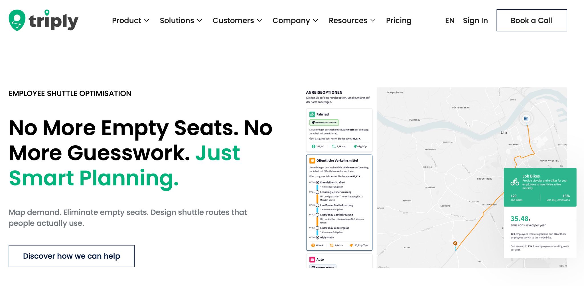
Building a scaled model by hand gets messy fast. Change frequency, and your cost per vehicle hour shifts. Change vehicle size, and your load factor forecast moves with it. Add more operating hours, and driver costs climb. In a spreadsheet, these links can turn into a headache.
triply's pre-investment shuttle model pulls site data, shift patterns, and commute inputs into one model. That lets you test different shuttle setups and see the projected effect on uptake, cost per boarded rider, and Scope 3 Category 7 emissions before any budget is approved.
The practical upside is simple: finance, operations, and sustainability teams can work from the same set of numbers instead of three different versions of the story.
Use triply's employee shuttle optimisation model to test scenarios before you commit budget.
Once your scaled model is ready, put it next to the pilot results and review both at the same time. Look at ridership, load factor, cost per boarded rider, Scope 3 Category 7 impact, reliability, and satisfaction together. One metric on its own isn't enough.
Set your success criteria before the pilot begins. Then compare the pilot actuals with the scaled forecast. Use the plateau period, not the launch week, as your decision baseline. Early spikes can look great on paper, but they often don't reflect normal demand.
The table below gives your internal committee a simple framework for the decision:
| Decision | Key indicators | Action |
|---|---|---|
| Go | Load factor 60 to 80% [2]; on-time performance above 95% [2]; high satisfaction; ridership goals met | Approve the permanent programme and phase expansion |
| Revise | Load factor below 50% [2]; demand concentrated in specific shifts; high wait times | Adjust frequency, vehicle size, or operating hours, then test again |
| Stop | High cost per boarded rider; consistently low ridership; better served by existing transit or walking | End the pilot and reallocate budget to higher-demand corridors |
Don't let launch-week peaks outweigh the plateau.
Once the decision pattern is clear, write the assumptions into the business case. Before the committee review, record the data used, where it came from, and any exclusions.
For finance, note the full cost base, the cost per boarded rider, and any avoided costs such as parking lease savings, along with the source for each figure. For operations, document your baseline ridership counts, the data collection method, such as automated passenger counters or badge scans, and any periods left out of the analysis, like public holidays or plant shutdowns. For Scope 3 Category 7, record the emission factors used, the origin-destination data showing that the shuttle is replacing single-occupancy vehicle trips rather than pulling people away from existing public transport, and the calculation method.
Label every numeric claim in the business case as either:
That step helps during internal audit and keeps finance, operations, and sustainability working from the same numbers.
The process comes down to three steps: define success before the pilot starts, measure ridership, load factor, cost per boarded rider, Scope 3 Category 7 impact, reliability, and satisfaction during the pilot, then model the scaled programme before any budget is approved.
triply's pre-investment shuttle model lets you run those scenario tests by bringing site data, shift patterns, and commute inputs into one shared model. Finance, operations, and sustainability can test the assumptions together before a decision is made. Use triply's employee shuttle optimisation model to test your shuttle scenarios before you commit budget.
This article is general information only and does not constitute legal or tax advice.
A shuttle pilot doesn't have a set length. It should run long enough to gather steady data across normal demand cycles. In plain terms, you need enough time to see how people use the service on busy days, slower days, and during normal travel patterns.
Some pilots are brief. Others run longer. Agencies such as Metro have used longer review periods for on-demand services when they needed a better read on usage and costs.
Before turning the service into a permanent offer, compare results against the goals you set at the start. Look closely at:
This is general information, not legal or tax advice.
If your shuttle pilot starts with low ridership, don’t treat it like a flop right away. Start with the data and figure out why demand is low.
Look at boarding counts by stop and time, origin-destination patterns, and load factor. That gives you a clearer view of where the current service design is off.
From there, you can make practical changes. You might adjust headways, cluster stops, or shift service hours so they line up better with actual demand.
And if the pilot still misses your goals, the findings still matter. They give you a more evidence-based way to decide whether to scale the service or change course.
This is general information, not legal or tax advice.
Measure commuting CO2 impact by comparing total greenhouse gas emissions from your current shuttle service with a scenario where the service doesn’t exist.
The idea is simple: look at total mileage and energy use in both cases, then calculate the gap. That difference shows the net drop in emissions linked to the shuttle service.
This is usually reported as the total tonnes of CO2 reduced per year.
This is general information, not legal or tax advice.