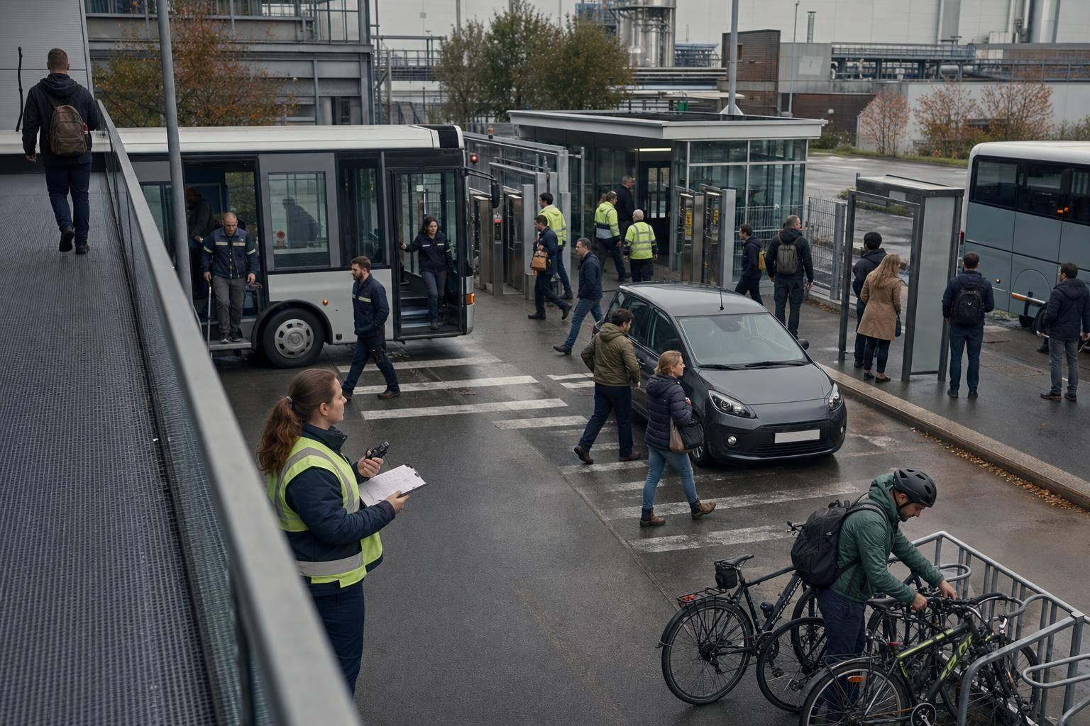
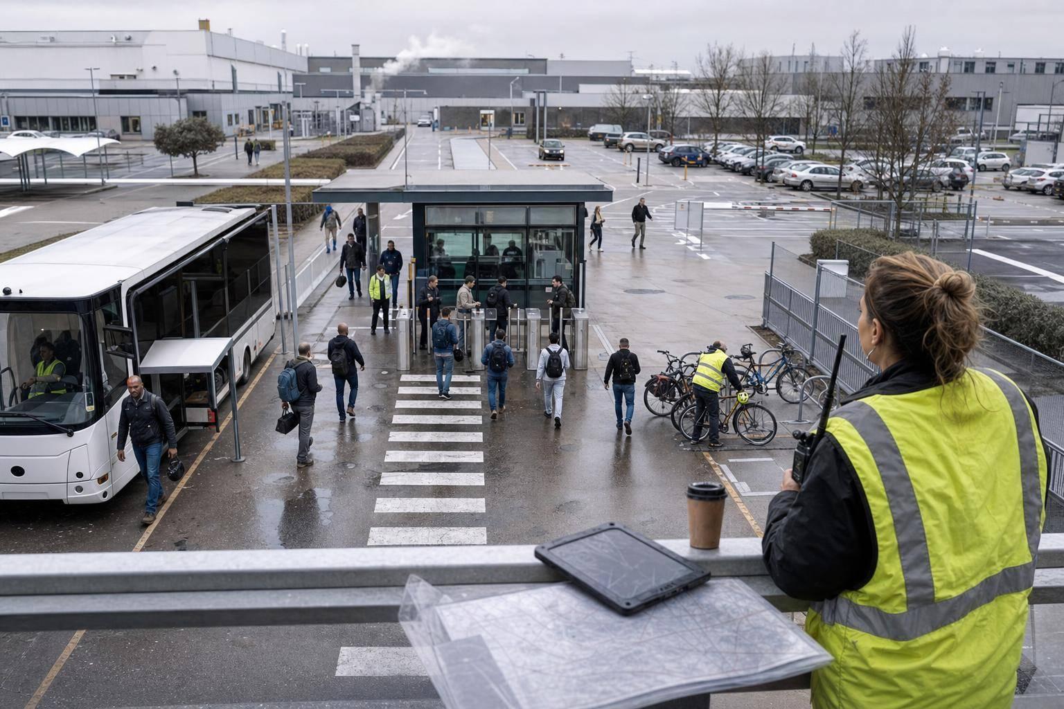
Cut shift-transport waste by testing routes, vehicle mix, load factor and coverage to lower costs and commuting emissions in the Bajío.
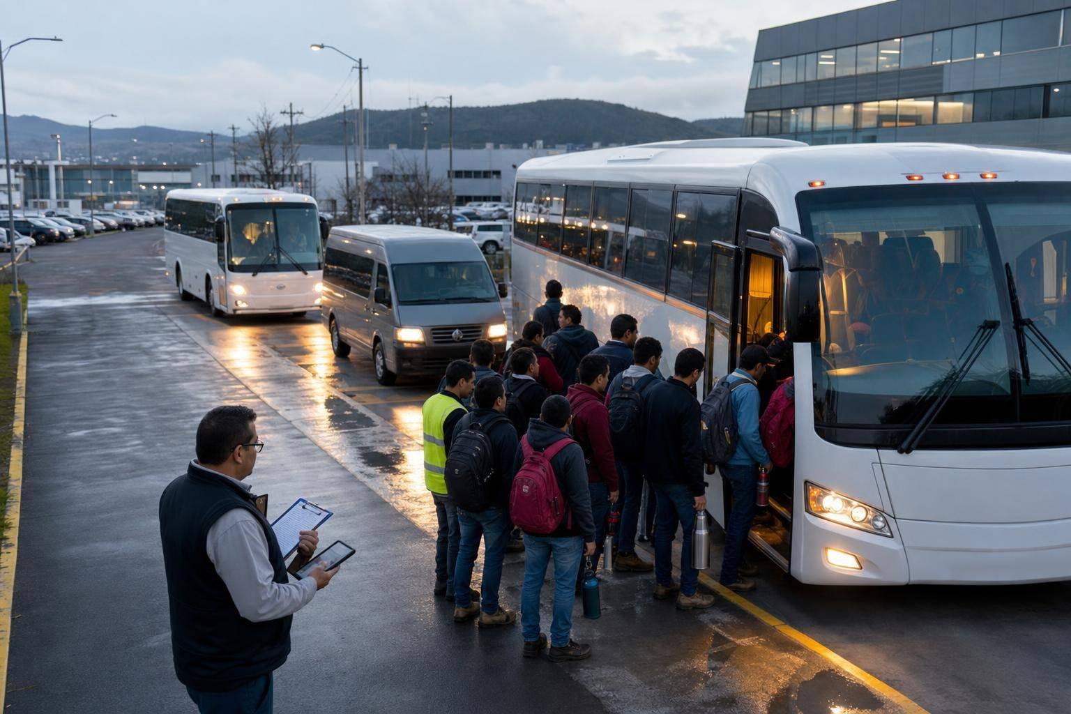
Factory shift transport in Querétaro and Guanajuato gets expensive when routes, vehicle size, and shift times stop matching where workers live and when they travel.
The article comes down to four checks:
If these four are not tracked by route leg and shift window, you are mostly guessing. That is when empty seats, long deadhead trips, waiting time, tolls, and weak stop placement can push spend up while coverage still falls short.
A few plain facts sit behind this:
| What to check | What it shows | Common warning sign |
|---|---|---|
| Load factor | Seat use on a vehicle or route leg | Too many empty seats |
| Cost per boarded rider | Spend per actual boarding | High cost on low-use legs |
| Coverage | Whether service fits worker locations and shift times | Gaps in one catchment or shift |
| Scope 3 Category 7 | Emissions from employee commuting | Extra vehicle-km and low seat use |
Across the Bajío corridor, many industrial parks sit in peri-urban or rural areas, well away from the main neighbourhoods where employees live. Plants near Silao, Irapuato, Celaya, and Querétaro are often placed on the outskirts, while workers are spread across small municipalities and rural communities.
That setup makes transport planning awkward. A fixed charter route usually has to travel long distances and stop many times just to reach enough riders. And once a route starts stretching like that, efficiency drops fast.
You end up paying for empty kilometres between stops and between shifts. Those kilometres still hit the budget, even when no one is on board. It also means each stop pattern becomes more sensitive to route length, vehicle size, and shift timing.
Three-shift manufacturing setups create another problem: demand arrives in spikes. Workers need transport at fixed handover windows, then demand falls away for hours.
So buses are planned for the busiest moments, not for the whole day. The result is pretty plain: off-peak trips and return legs often run with too few riders, which pushes up cost per boarded rider. Without steady boarding data, it's hard to prove where that waste is happening.
Overtime adds even more friction. If shift end times change, buses either wait around and add cost, or they leave too early and miss workers. Neither option fits neatly into a static route plan. That's why load factor and cost per boarded rider need to be tracked by route leg, not only at site level.
Even when the geography and shift structure are clear, planning often stalls because the data behind it is patchy. If you run several sites across Querétaro and Guanajuato, comparing routes gets messy when each site is planned on its own.
That kind of site-by-site planning hides waste across the network. You can't easily tell whether combining routes would cut cost without leaving a coverage gap. The next section turns those root causes into the metrics you need to size and compare the network.

Use a small set of metrics to spot where a network is running with too many empty seats or failing to serve actual demand. The main ones are load factor, cost per boarded rider, coverage, and Scope 3 Category 7. Load factor and cost per boarded rider are especially useful because they show where capacity and spend drift apart.
Load factor is the number of boarded seats divided by the total seat capacity on a vehicle or route leg. If load factor is low, it often means the vehicle is too large for the level of demand, or the route does not match where and when people actually board. Once you see that, cost per boarded rider starts to make a lot more sense.
Cost per boarded rider takes the total route or network cost for a set period and divides it by the number of riders who actually boarded. For finance teams, that makes it easier to track over time because a contract total becomes a per-person figure. If one route leg shows a high cost per boarded rider, low load factor is often part of the reason.
Track both metrics by:
That split helps you see where capacity is being wasted and where the service misses demand.
Coverage means workers can get to a stop, board before their shift starts, and get back after the shift ends. When you map coverage against real shift windows and worker locations, the gaps stand out. A simple route list will not show that. That is the gap a route list alone will not show.
This matters even more when your workforce is spread across several catchments and the service has to fit different start and end times, not just one nominal schedule.
The same data can also support emissions reporting. Low load factors and extra vehicle kilometres increase both cost and emissions. Under Scope 3 Category 7, which covers employee commuting, those emissions sit within your organisation’s footprint.
Use the same commute data for load factor, cost per boarded rider, coverage, and Scope 3 Category 7 estimates. Home locations, shift patterns, route lengths, and vehicle types feed both the cost model and the emissions calculation. triply uses the same inputs to model commutes and test route and vehicle changes before you invest. It also supports Scope 3 Category 7 reporting, so finance, operations, and sustainability teams can work from one consistent picture.
When you buy charter-bus service for shift workers in Querétaro and Guanajuato, the total price usually comes down to a small group of cost drivers: route length, vehicle size, driver hours, waiting time between shift waves, and tolls.
That sounds simple enough. The problem starts when all of that is rolled into one contract price. Once that happens, it gets much harder to spot which routes are expensive and which ones look fine only because better-performing routes are balancing them out.
Idle time is a good example. A vehicle can finish one shift run and then sit still until the next wave starts. Even though the bus is not moving, it can still add cost during that gap. Depending on the contract, that waiting time may appear in driver pay or in other fixed charges. Tolls on major corridors add yet another layer of cost every time the bus runs.
Vehicle size is often where the biggest hidden waste shows up. If you put a large coach on a route with a low load factor, your cost per boarded rider stays high even if the service seems to be working on paper. Put plainly: empty seats do not lower the base vehicle or driver cost.
Fixed routes have a habit of staying fixed. Once a route is in place, it can go unchanged for too long.
Meanwhile, the world around it moves. Worker home locations shift, shift schedules change, and coverage needs do not stay still. If the route network does not move with those changes, some corridors start carrying more riders while others fall short. At a network level, your overall cost per boarded rider may still look acceptable. But that can hide the fact that one route, or one shift window, is dragging down performance.
The same issue appears when coverage is not tested against actual demand. You might be serving one area more than needed while another area gets only thin coverage. That is why route-level analysis matters before you add vehicles, change contracts, or redesign service.

Once you can see load factor, cost per boarded rider, coverage, and Scope 3 Category 7, the next move is simple: test changes before you spend money.
That matters because shift transport decisions can get expensive fast. Add a vehicle too soon, renew the wrong route setup, or keep a weak network in place, and costs stack up while service still misses parts of your workforce.
Start with worker postal codes, shift patterns, and site data to build one commute model across Querétaro and Guanajuato. You don't need to survey every employee first.
For multi-site operations in the Bajío corridor, triply lets you bring Querétaro and Guanajuato into one consistent view. That means you can compare worker clusters across plants using the same logic, instead of piecing together separate spreadsheets or site-by-site assumptions.
In plain terms, you get one model that shows where demand overlaps, where routes may be duplicated, and where coverage gaps sit.
Once the commute model is set up, you can test measures before you commit budget. That may include route consolidation, stop changes, vehicle mix, or shift staggering, depending on where the gaps and weak spots are.
The table below is illustrative only.
Use the same model to compare options side by side.
| Scenario | Load factor | Cost per boarded rider | Coverage | Scope 3 Category 7 impact |
|---|---|---|---|---|
| Current network | Low on some routes | High on those routes | Gap in one worker cluster | Baseline |
| Route consolidation | Higher overall | Reduced | Maintained | Lower per-rider emissions |
| Smaller vehicle mix | Higher on shorter routes | Reduced on shorter routes | Unchanged | Moderate reduction |
| Shift staggering | Improved across waves | Reduced | Improved | Lower overall |
This kind of side-by-side view helps you test which change cuts waste without breaking coverage. Maybe one route should be merged. Maybe a smaller vehicle works better on shorter runs. Maybe the issue isn't the route at all, but shift timing.
If you manage shift transport in Querétaro or Guanajuato, model your network in triply before you add vehicles or renew a contract.
That gives you a clearer case for each decision on cost, coverage, and emissions.